IamMe
Color lens as a Make-up Tool
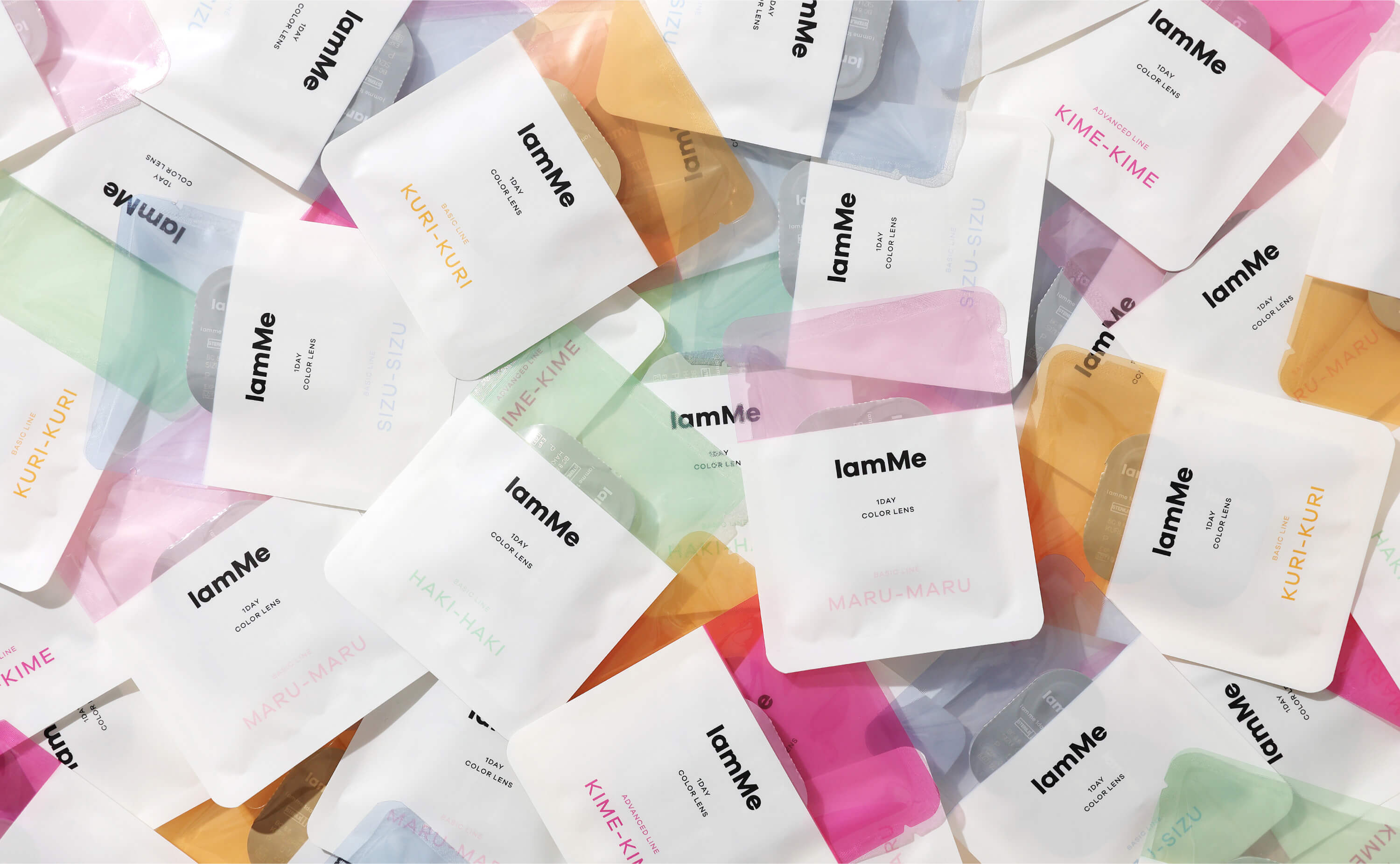
We conducted comprehensive creative production for a color contact lens brand that aimed to redefine the conventional notion of uniform beauty and instead positioned itself as a “makeup tool.” Our objective was to introduce a fresh concept that focused on design aesthetics and size. Starting with the brand’s naming, we carefully crafted a name that reflected its new positioning as a makeup tool rather than just a standard color contact lens. We wanted to emphasize the brand’s transformative and creative potential. In addition to the naming, we also designed the packaging to be visually appealing and aligned with the brand’s concept. The packaging was not only functional but also showcased the brand’s unique design elements, capturing the attention of the target audience. Furthermore, we extended our creative expertise to develop a user-friendly website and app. Through these digital platforms, customers could explore the brand’s product range, access makeup tutorials and tips, and make convenient purchases. By challenging the notion of uniform beauty and embracing the idea of color contact lenses as a makeup tool, we aimed to empower individuals to express their unique styles and enhance their overall makeup looks. Our comprehensive creative production, encompassing naming, packaging, website, and app design, aimed to create a cohesive and engaging brand experience that resonated with the target audience.


Credit
IamMe
| Year: | 2020 |
| URL: | https://iamme.jp/ |
| Catergory: | Creative Direction / Art Direction / Graphic Design / UX,UI Design |
Logo / CI/VI / Package / Web / App / Visual
TOONE
Client: TOONE inc.
-
Creative Direction: Kazuhiko Hayakawa ( H inc. )
Art Direction / Graphic Design / UX,UI Design : Hiroka Hasegawa ( H inc. )
and others.